A Facebook lead ad can be a highly effective method of attracting customers, with or without a Context Card. While browsing on Facebook, users can simply input their information directly in the ad, without having to click off and interrupt what they were doing. This makes it much easier for them to provide the information that you want, since if falls in line with the natural flow of the actions they are already taking. But sometimes they need a little more information, in the form of a Facebook Lead Ad Context Card.
What is a Context Card?
But what if they want more information on your brand or offer? What makes Facebook Lead Ads so attractive to both businesses and users can actually become a stumbling block for more involved offers or high-ticket products. A potential customer typically doesn’t want to leave Facebook, and a Lead Ad addresses this desire to remain on site. But if they want more information, a traditional Facebook Lead Ad does not make it easy to provide additional details. This is where a Context Card comes in, which is also called a Welcome Screen. A Context Card is like a mini landing page right within the Facebook Lead Ad. You can summarize your business, provide offer details…anhything to give your Facbook Lead Ad more “context.”
When to use a Context Card…or not
A Context Card lets you spell out the terms of the offer, how you will follow up, what your company is about…whatever you want! It’s an additional feature of a Facebook Lead Ad that accompanies the creative you are already running, so there’s no additional ad buy or landing page. When a user clicks on a Facebook Lead Ad with a Context Card, that additional information will be shown before they are given the Lead Form to submit their information.
While completely optional, a Context Card is great for offers or services that require more information, or a cold lead that may require a little more introduction. Users are more likely to provide their information to someone they know and trust, and Context Cards can be a great way to solve for this quickly and efficiently with little to no additional creative assets. Just a few extra clicks during the Facebook Lead Ad setup and your Context Card will be up and running!
Make sure that your offer warrants a Context Card, however. For simple, low-cost offers or users who are familiar with your brand they could actually be a deterrent as they create more work to get to the lead capture form. You may want to run a few tests before adding Context Cards to all your Facebook Lead Ads.
Context Card Headlines
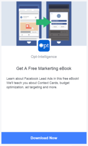
Your Context Card headline can be up to 45 characters, so it’s best to be short and to the point. The headline appears below the Context Card image (more on that shortly) and your Facebook page icon (typically your brand logo). You are free to choose any headline you like, but the hardest working headlines fall into one of three categories.
The most compelling headline explains what they will get by providing their information to you. A free ebook? 10% off? Access to exclusive inventory? Whatever it is, let them know clearly and concisely. “Free Marketing eBook,” “Save 10% Today,” or “Access to Exclusive Sales” explain what they’ll get.
If you are gathering leads without a clear offer, you could simply direct people to fill out the form. Keep in mind that there is also a call to action button at the bottom of the Context Card, so take care not to repeat yourself. You may want to combine with the offer, such as “Get Your Free eBook Today.”
For a cold lead, you may want to summarize your business in the headline and then explain in more detail below. For example, “The Leading Marketing eBook Publisher.”
Context Card Image
The image on your card can be the same as the one featured in the rest of your Facebook Lead ad, or something completely different. It can be tempting to keep the creative all looking the same to provide a cohesive brand feel and save on design costs, but test using different imagery. Stay in the same tone or color palate to keep the look and feel consistent but make it clear this is a different screen they have not seen before. This makes them more likely to read the information and click through to submit that lead form.
Keep in mind that the assets you choose will be displayed in the Facebook Newsfeed alongside pictures of friends and family. Imagery needs to stand out but not be overly salesy or jarring, as that can be a turnoff. People are on Facebook to connect with friends, not be sold to, so don’t clutter their feed with an ugly Lead Ad. These ads are also most likely to be seen on mobile, so simplify for smaller screens.
Formating Your Context Card
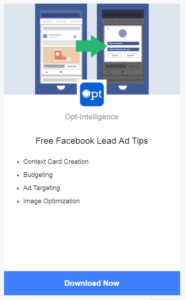
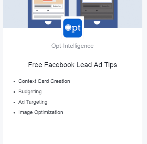
A Lead Ad Context Card can use bullets to explain the sales proposition and elaborate on the business, or standard  paragraph form. It all comes down to efficiency: how complex is the message you need to convey? Is your offer complicated? Bullets may simplify. But they can feel more casual, so a high-priced service may benefit from the more formal paragraph with full sentences.
Context Card Messaging
No matter which format you choose, what type of headline you run or the imagery you take, the overall Context Card messaging must be three things: simple, compelling, and easy to understand. Remember, you’re competing with photos of adorable grandchildren as well as competitor ads. And if this is a cold, first touch, you need to gain attention and trust fast in order to get the valuable lead information you need. Straightforward works best, from the headline to the CTA, and for everything in between.
Call-To-Action Button
Your Context Card gets its own button as well. Keep in mind that someone who has clicked on your Facebook Lead Ad but not yet provided their information will be reading this Context Card. They liked what you’re offering enough to stick around, but need that extra push to provide their email address or phone number. Yes, you have some space to convince them, but the headline and CTA button are going to do most of the heavy lifting here.
Test Everything
As you may have noticed throughout reading, the key to a perfect Facebook Lead Ad Context Card is testing. There is no one right solution; it varies based on audience, product and even season. Test each and every element separately until you find the right mix of headline, image, format, Call-To-Action and messaging that works for you.
Some may even find that a Context Card negatively impacts their lead submissions. And that’s OK! Not every business will benefit from a Context Card. but make sure to test varied elements of yours before deciding that the Context Card as a whole is to blame—it could be just one piece of it.

